After its first season, big changes were in the offing for Gerry Anderson's space epic, Space:1999 (1975 - 1977).
Fred Freiberger, late of Star Trek's third season, came aboard the series as producer, and ushered in a regime of dramatic re-vamps and re-thinks. To this day, those changes remain the source of great controversy.
Most importantly, Year Two of Space:1999 was to offer an enhanced sense of pace and "humanity." Action and color were thus the order of the day, and those two qualities are the ones most dramatically reflected in the season's introductory montage, featured for this installment of Outré Intro.
As the montage commences, we see two brightly-colored planets looming in space, moving towards us, even while a cluster of stars is visible in the frame's lower quadrant.
Notably, the alien worlds are bright and colorful in contrasting ways, blue and pink. The color enhances their strange-ness, but also suggests the visual dynamism that Freiberger sought in the re-tooled series. The white-on-white trademark minimalism of Year One was to be a thing of the past.
Next, a space age "teletype" spells out the premise of Space:1999, beginning with the location of a planetary disaster.
We see an Eagle fly over Moonbase Alpha, and then we learn of the catastrophic specifics of the disaster.
A "massive nuclear explosion" has occurred, the moon is "torn out of Earth's orbit" and the natural satellite is "hurled into outer space."
Note that all these images -- accompanied by Derek Wadsworth's (1939 - 2008) exciting, driving new theme -- expressly feature movement. We see an Eagle fly towards the camera. We see a bundling of colorful, expanding explosions. aAd then we see the Moon moving from its orbit, into what appears to be a coruscating space warp or vortex.
All these images suggest motion, and accelerating action. Similarly, the brevity of the teletype "message" suggests not only an emergency transmission, perhaps from Alpha itself, regarding the catastrophe, but the new season's intended sense of crisp clarity.
The camera keeps moving in the next image.
We pan quickly across a row of high-tech computers, and the words "RED ALERT" (in all caps) flash dynamically, super-imposed over the space age equipment. This image again stresses movement (the camera pan), color (the flashing words), and the sense of adventurous urgency.
The impressions is that we are in the midst of an emergency, with no time to stop, and excitement is building.
Next, we meet our cast, and once more, they are introduced in action-packed poses.
Martin Landau, playing Commander Koenig, spins around in his seat in Command Center, whirls around, stands-up, and fires his laser.
Secondly, we meet Dr. Helena Russell (Barbara Bain), walking urgently through a Moonbase corridor, after leaving the Life Support Unit.
If you contrast these views of the lead actors with their Year One montage "static" poses, the difference in approaches is all the more apparent. The Year Two meme, once more, is action and color.
These qualities are further high-lighted with the title card that practically lunges onto the screen, right to left.
This is (the new) Space:1999.
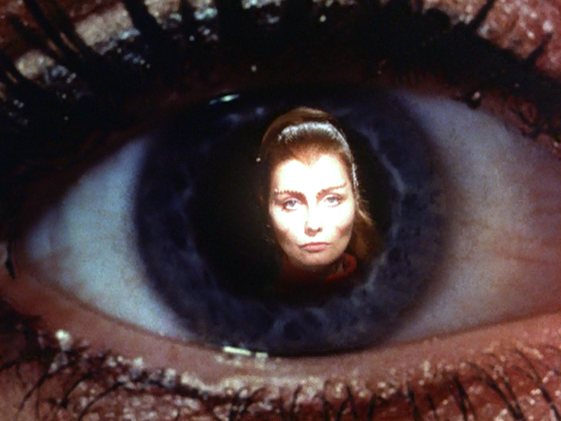
The next order of business for the montage is adding a new and unusual character, Maya the metamorph.
We move in on Maya's eyeball, and see the different animals she can turn into, including a dog, a bird and a tiger.
Next we see Maya in her humanoid form, and get the title card introducing Catherine Schell.
These images, while rapid-fire and action-packed, are there primarily to convey crucial information about Maya so that her nature and capabilities can be understood before the audience even begins to watch an episode.
This part of the intro thus sells a character concept. Incidentally, it was the concept of Maya -- a shape-shifter -- that got the series renewed for a second year.
Finally, we get Gerry Anderson's title card, next to a shoot of a slowly-spinning moon, home base for the series. After all the action, all the movement and all the color, we close with a view of sanctuary, safety, and, essentially family. The moon is home.
Although I like and enjoy Year Two (and especially Catherine Schell's portrayal of Maya) very much, I have always preferred the more philosophical, more thoughtful Year One of Space: 1999.
Yet even with that bias in mind, it is indeed impressive how adeptly (and quickly...) this Year Two introductory montage "sells" the series in its new format.
The exciting music, the colorful visuals, and the near-constant motion -- as well as the surreal ingenuity of the Maya "eyeball" imagery -- really express the nature of Space: 1999 Year Two well. The montage says, in essence, space just got a whole lot more exciting, and dynamic.
Impressively, the montage manages to present the mood, the set-up, and the new character of Maya in just under 45 seconds. Love or hate Year Two, the imagery is effective.
Impressively, the montage manages to present the mood, the set-up, and the new character of Maya in just under 45 seconds. Love or hate Year Two, the imagery is effective.


I remember very well my initial reaction to the opening of "The Metamorph". Immediately I liked the new signature music. It was also a tune that stuck... immediately. (On my own blog I wrote about my appreciation of composer Derek Wadsworth's contributions to the series.)
ReplyDeleteThe titles are perfectly in tune with Year Two's stories.
This goes against the grain, of course, but I think that Y2 is superior to Y1. As a 'concession' I think that Y1 had the episodes that hit the highest peaks.
I liked the technical improvements, especially the increase in instrumentation in the main control area. (No doubt the upgrades were demanded by Fred Freiberger.)
The biggest mistake was adding a metamorph. (Notice I did not say "Maya".)
Your Space: 1999 reviews are stellar, John.