


Sometimes
I have termed the Star Trek movies 1979 – 1991 “my Star Trek” because of
where they happened to fall in my life. The original Star Trek was cancelled
before I was born, and The Next Generation came around when
I was a senior in high school. So it is
the movies that I closely associate with growing up, though of course I watched
the original series in reruns as well.
It
may be part and parcel of these feelings about “my” Star Trek era, but I have
always felt very positively about the upgraded Enterprise interiors and
exteriors, as well as the new Starfleet uniforms. To my eyes, they looked simultaneously more
futuristic and more realistic than their predecessors.
My
favorite version of the Enterprise is the one featured in Star
Trek: The Motion Picture. I know
some viewers tend to complain about the length of the dry dock scene with
Scotty and Kirk surveying the great ship, but I have always felt that this
particular moment -- better than any
featured in the preceding TV series -- sells beautifully the size and
grandeur of the starship.
This
is important stuff, because the scenes involving V’ger -- which reveal the Enterprise dwarfed by comparison -- thus sell the
enormity of the film’s menace. In other
words, the Enterprise is huge…and V’ger is absolutely ENORMOUS. Encoded in this
comparison is the sense of alien life being truly alien; of being outside the
realm of human scale. I admire the film’s success transmitting this
notion… especially when so few science fiction films even try.

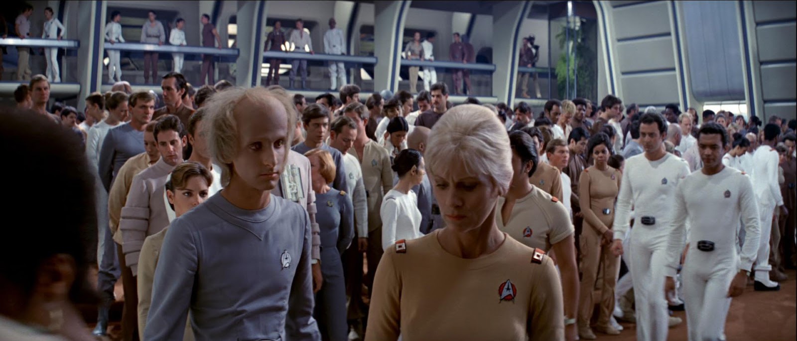
The
subdued lighting inside the new Enterprise also helps to sell the overall reality
of the starship. Much of the time, Wise’s
camera takes up a “crewman’s eye” position on the bridge that makes us feel
like we’re right there, conversing with the officers and watching events
unfold. The number of insert shots of
view-screens and read-outs further enhances the sense of us being right there
on the Enterprise, receiving and interpreting information.
I
like this approach very much, and the bridge set in the film is so great
because all those displays and graphics actually look real, and the controls
seem functional. That’s not an
observation you can make regarding the TV series bridge and the painted on,
rarely-changing screens.
I
guess I’m in the minority on this, but I also like how sleek, form-fitting,
unisex, and deliberately un-military
the uniforms of Star Trek: The Motion Picture appear. They are simple, elegant and much less garish
than their predecessors (again reflecting a shift towards Space: 1999 and minimalist
1970s aesthetics…). For me, the TMP
uniforms signal visually the “equal” nature of all demographics (male and
female, alien and human) in Starfleet.
No more mini-skirts.
Star
Trek: The Motion Picture
is much-criticized, but I agree with your assessment. I feel that the costumes,
miniatures, and sets all successfully broadcast the impression of a real
starship and starship crew living in a future age. At times, accordingly, the film boasts an
almost documentary-like quality. What The
Motion Picture forsakes in fistfights, phaser battles and conventional
thrills, I feel it gains in verisimilitude.
In
terms of the new Star Trek movie, I give lots of credit to J.J. Abrams and his
team for really “owning” the original TV uniforms and making them look good on
the big screen. I just have to think
there was probably a tremendous creative push to replace the original uniforms
with a sleeker, less garish color scheme, but god bless Abrams, he didn’t
succumb to that pull.
The
new bridge looks futuristic, but in broad strokes the lay-out is the same, with
the familiar captain’s chair, front console, and turbo-lift. And I absolutely love that the original “chirping”
sound-effects from the series were retained.
In some sense, that affectionate and faithful touch “sells” the new
bridge design for me.


I
don’t know that I possess the deep well of affection for the new Enterprise
exterior and interior designs that I do those of the Motion Picture Era, but I
nevertheless count them a success. The
ship felt like Star Trek to me, only Star Trek re-interpreted for the 21st
century.
Again,
I’m sure there was a considerable pull to go “gritty and dark” and make the
Enterprise more submarine-like and less clean and bright, for instance.
I’m
glad the filmmakers didn’t succumb to that urge.


John, your thoughts on Star Trek production designs is perfect. Like you, as a boy seeing STAR TREK:THE MOTION PICTURE in 1979 that drydock Enterprise scene gave me goosebumps, pure joy at the mighty majesty of the refit 1701. I truly wish that J.J. Abrams would do a flyover of his new Enterprise 1701-A that we saw launched in STBeyond.
ReplyDeleteSGB
John, I'm from a different school here. For me, the TMP bridge was a step down from the original (especially the "Cage" bridge). The ring of graphic and schematic displays disappeared to be replaced by patches of clear light bulbs. Hello Jupiter 2 cheapness.
ReplyDeleteTo be honest, this designer was never impressed with the TMP Enterprise sets, even if they were direct descendants of those from the series: plates and grills. Of course, a feature film has much more time and money.
The costumes' tones looped back to those of "The Cage" -- and pants came back to the women. Director Robert Wise requested this. The bright colours of the original would be "too much" on the big screen; and the need to sell colour televisions was unnecessary.
I appreciate and enjoy your take, however. These feelings we have are personal.
Funny you should post this piece; an upcoming posting on my blog (simonstlaurent.blogspot.com) will outline what film/tv design influenced me as a like designer. An inordinate selection will be from the STAR TREK (the original) -- and Messrs Guzman, Bachelin, Chang, and, of course, Jefferies. A big reason for this weighting is due to that show's constant airings in my childhood and youth. That and the many brilliant and ultimately iconic designs. (Ken Adam is another influence.)
Nice to have you back, John. I understand you have been very busy.